Images     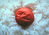  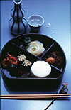  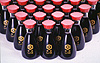    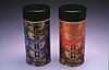 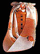  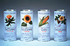 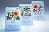 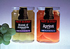 |
III. GK's Package Design We are now in the age of rapid change. The sudden diversification of values has brought complexity and sophistication to everyday living. But on the other hands one's individuality has become suppressed in the increasingly unified material surrounding. The mission of graphic design in this age is to devise a new design concept that exerts a strong self-identification. We have proposed three axes on which to base the everchanging living environment. The three axes illustrate the relationship between man and his surrounding, material things, environment and information. In a word, this is about the interface between man and his living environment which is precisely the concern of design. The three concepts raised in the section in traditional Japanese packaging relate to our viewpoint today in the following manner: 1. The innovation for preservation of food related to "material things". 2. The seasonal sense for survival relates to the "environment", the source of external elements. 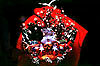 3. The spirit of gratitude as a means of future security relates to "information".
Each of these three axes furthermore has two aspects: "Environment" involves standardization and dramatization. "Material things" involves identification and customization. And "information" requires interpretation and adaptation. The fundamental purpose of graphic design is to interpret the messages and meanings in everyday life, so that as the result an appropriate relationship is visibly born between people's spirit and the living environment. We feel that by taking into consideration all the six aspects I've mentioned earlier, we can satisfy the goal of graphic design. STANDARDIZATION Beautiful things are universal. Delicious food knows no bounds. Outstanding things transcend time and space and become universal. Soysauce was introduced to Japan from China in the 6th century and was refined to the Japanese taste. Ever since, soysauce has become an indispensable seasoning in creating the Japanese cuisine. But packaging soysauce has always been a headache. 
This is a soysauce dispenser for table use. It's easy to hold and pour with a non-drip cap that keeps the tabletop clean. This bottle has become a familiar character on the dining table for over 24 years. Already 150,000,000 bottles have been sold. With such ubiquity, it has come to symbolize soysauce itself. This is a one liter package which contains the monthly soysauce consumption of an average household. This package took root with the increase of supermarkets. The secret to its popularity was its convenient size and weight for shopping housewives. DRAMATIZATION Gift package embodies the giver's feeling of gratitude, celebration, desire and hope. It transcends its existence as mere package and transforms into a spirit which connects people with people. Seafood peculiar to Japan is dried seaweed or laver. It has long been a classic gift in Japan. This package expresses the image of the mist drifting from the sea to the mountain, overlapping with the mild taste and flavor of the laver. 
The graphic gradation conveys the traditional Japanese elegance. The beautiful sea that transforms from glittering gold to deep purple at dawn and dusk. The image of the rushing waves was combined with that of the salty sea breeze for this package. The package that contains the spirit is further wrapped in furoshiki, a traditional wrapping cloth. And when the furoshiki is opened the spirit of the giver unfolds. IDENTIFICATION Identifying good, tasty food is no easy task. To select the right taste for you from the myriad of choices available, visual identity is needed. "Love at first sight" comes before "love at first bite", as with a man and woman. This is a package of salad oil. It's an all-purpose oil which can be used for cooking or making salad dressing and mayonnaise. But with the recent popularity of gourmet food, the consumers have become more taste-specific and fastidious, resulting in a wide variety of seasonal oil flooding the market. Package in this case must clearly identify its content. Illustration can sometimes more poignantly express the essence than a photograph. This is fruit preserved in syrup. The color and shape of the fruit itself is the most eloquent spokesman of taste and quality. This package tries to convey the beauty of the content itself.   Think Visually, Act Graphically! |